Opinion Flat Shaded Polygons Did Nothing Wrong

Crayon

Schizofantastic
May 25, 2019
120
243
43
43
Wow what a stunning upgrade from wireframe!!


Flat shaded polys used to save a lot of cycles, but today they can save a lot of money and time.


I personally love the look. I think it can convey sufficient detail (eye color, shirt buttons, fingernails, etc) It’s easily readable and can be very lively with color, or muted and sufficiently realistic with a bit of imagination.

Of course, we expect more from high production games. We expect things like… well alot more lol. It’s obviously acceptable for indie games but what about somewhere in the middle? Where is the cutoff where flat shaded polygons would disappoint you? Like if someone made a dmc clone for $20 with flat shaded polys, would you find that weird? What about a $40 flight sim? Would that have
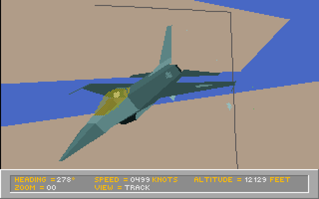

More pointed question: If witcher 3, Monster Hunter World, Prey, etc was flat shaded polygons, would you still play it?

Throw in gouraud shaded polys because what the hell.

 
Last edited:

EdwardTivrusky

Good Morning, Weather Hackers!
Dec 8, 2018
7,396
12,484
113
Falcon 4.0 was the business back in the day. I think i spent half my gaming life playing low-poly, flat-shaded games at stupidly low framerates!

Driller and Eclipse ran at 60 frames-per-minute on my old 48k Speccy. Any of the early Atari ST/Amiga/PC/Arcade titles that tried 3D had flat or Goroud shading. Old N64 games were pretty much the poster boy for this style too but it was the 16-bit era where it was everywhere! I mean it was cutting edge at the time and looked freaking amazing for a long while.


I think Virginia fits to show how the effect is still being used today but in a modern style.

If a game using this style has great art direction then i have no problem buying and playing it even today. Higher resolutions, 60fps smoothness, gorgeous lighting or even ray-tracing... damn you could make something amazing now with these old-school techniques blended with modern capabilities.

Edit: Some of these are Smooth shaded rather than Flat shaded but blah blah blah. They evoke the aesthetic so i don't care. :shrugblob:
Crayon might though, oops.
 
Last edited:
  • Like
Reactions: lashman and Crayon

Alextended

Segata's Disciple
Jan 28, 2019
5,693
8,888
113
The actual old games look pretty slick even now, except for things like low res sprites used for effects and explosions which don't match up to the sweet polys.

Stuff like the original releases of MechWarrior 2 and X-Wing (they both got enhanced 3D acceleration editions with textures and stuff iirc).
 
Last edited:
OP
Crayon

Crayon

Schizofantastic
May 25, 2019
120
243
43
43
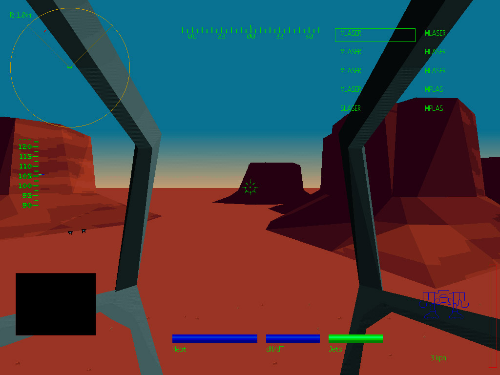
Oh I had never seen that. He said exactly what I was thinking going in. The original software rendered flat shaded version had the greatest visual impact. I don't like the other versions of mw2 at all. And it's not all because of the limited textures of the time either.

Look at MW3:


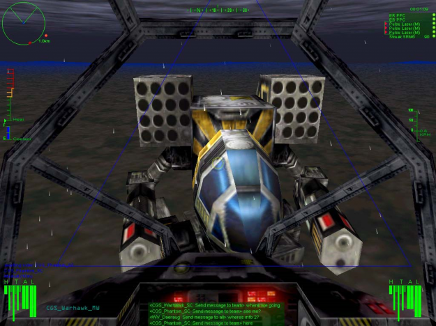
^^^ Here you are getting some fairly sharp texturing but I still don't think it has the impact of flat shaded mw2.


^^^ It's almost like there is an opposite to the uncanny valley. Where things are detailed enough to make an instant impression but lacking detail enough that your brain has to fill it all in. I do find the flat shaded mw2 to be highly immersive and atmospheric.

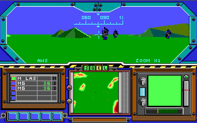
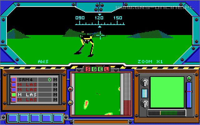
And the first one was no slouch either VVV


^^^ There were a lot of games with this level of graphics. And alot of them were great.

That mw2 tho... you got me wanting to play it.
 
OP
Crayon

Crayon

Schizofantastic
May 25, 2019
120
243
43
43
Aaaaaaaand im playing mech2 on a big tv on a comfy couch with a steam controller. When this came out i couldn't play it for lack of ram.

LOOK AT ME NOW
 
  • Like
Reactions: EdwardTivrusky
OP
Crayon

Crayon

Schizofantastic
May 25, 2019
120
243
43
43
Thinking about it more, there is a reverse uncanny valley effect. Its all about being starved for detail. I showed the MechWarrior 3 shot with the textures up there, and maybe that still looks a bit dated (~1999?) so check mw online for more modern graphics:


First off, the way these guys take the mech designs is kind of ugly imo. How do you compare that to flat shaded models with no detail at all tho? I don't know.

The near featureless MW2 models don't conflict with my headcannon of printed manuals and painted figurines. How does your imagination fill in these gaps? Probably a whole nother subject.

Bigger issue than the details of the designs tho, though: The scale. trying to get the scale of a mech to a landscape is actually pretty tough. Shit, just trying to get the scale right when you're looking out over a large map or standing next to a tree in any given game is not that easy.

With the flat shaded graphics, it's almost cheating lol. "This building is my only reference and its no more than a box, but the mech torso swings around all slow and the footsteps make big booms, thus i must be huge." It really is down to having to imagine everything.

If it was a text adventure, I would just tell you stomped on a car like it was a shoebox and you would get the picture. Scale! No graphics, no problem.
 
  • Like
Reactions: EdwardTivrusky