Community MetaSteam | September 2024 - The emperor protects, BOY!
- Thread starter Mor
- Start date
You are using an out of date browser. It may not display this or other websites correctly.
You should upgrade or use an alternative browser.
You should upgrade or use an alternative browser.
- Status
- Not open for further replies.

Discussion - What are you currently playing? (Week 40 of 2024)
New week, new thread! What are you playing? Entered the third arc in Dragon Quest V. Made through two dungeons already but interestingly no bosses in them. Encounter rates are noticeably higher and enemies are hard-hitting. Looks like there is a need to spend a few hours on grinding. Finished...
no difference for me. Still need Special K, still need to swap settings back and forth for no reason.Looks like Metaphor already got a patch. It's supposed to improve performance.
I tried running the full Special K on the Steam Deck, and no dice, it crashes the entire OS ( I suspect Special K is trying to do something that makes no sense in the context of Proton and freezes up). That said, given how terrible IQ is on the Deck, I don't think this is a game that I would recommend to play there. Maybe if you stream from your PC and downsample from something sufficiently high.
I recently came across an image of a popular upcoming game and I'd like to reopen the whole 'bad UI' can of worms that was popular earlier in the year when suicide squad released. I still maintain my opinion that game's UI wasn't worse than 90% of any other game's UI but that's besides the point now (or is it?...).
The image in question:
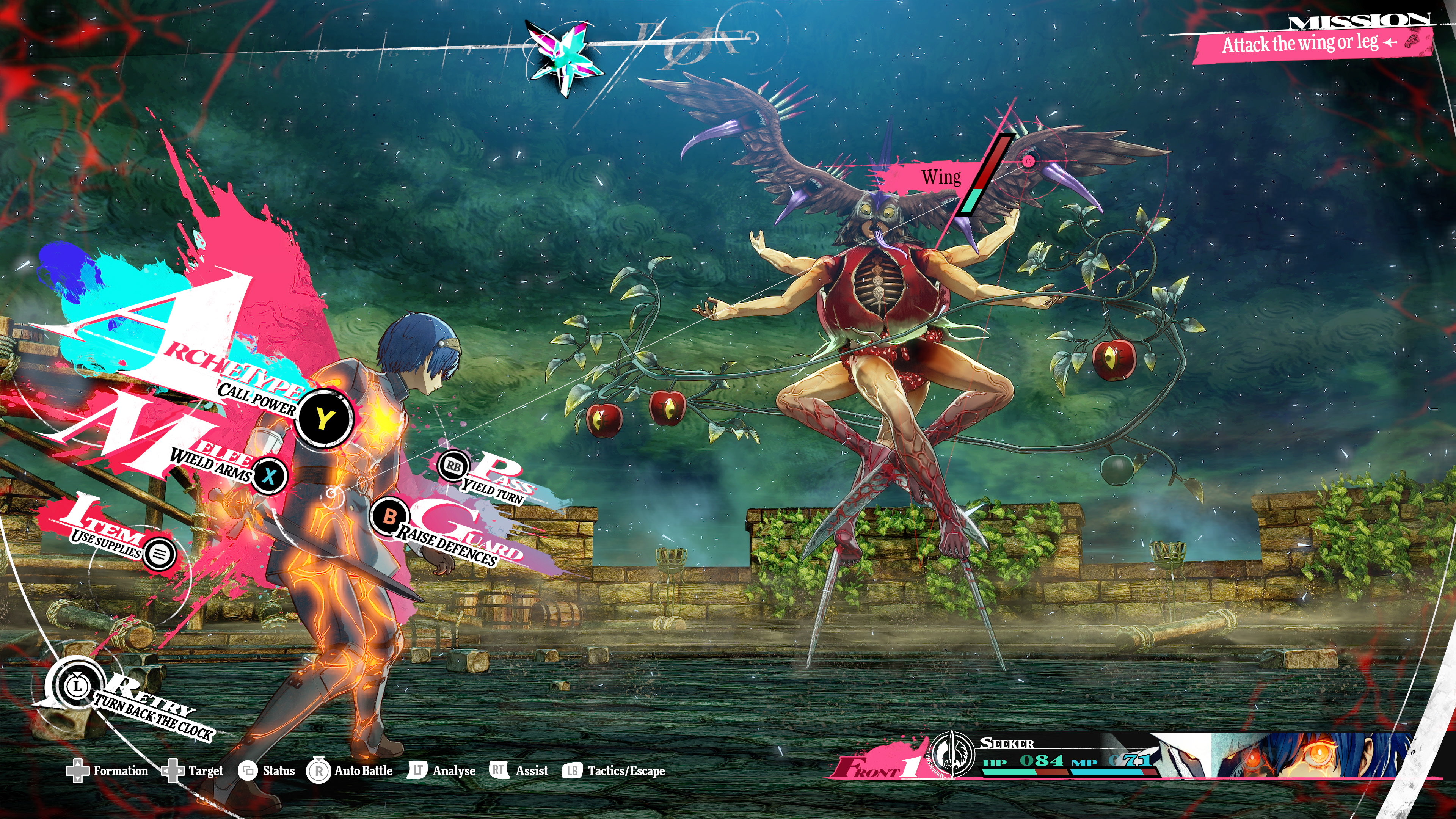
So, is this good UI design?
I know it's a turn based game but still... how can anyone glance a this and be instantly informed of what's going on or what options the player has? I'll give it points for style but from a usability standpoint, perhaps the single most important metric of an UI, it seems rubbish. I can barely read the text, the fonts and color palette choices are questionable at best, the HP/Mana indicators are so miniscule they might as well not even exist, etc... Honestly it's a mess or maybe I'm just getting old and my eyes are failing me (which really isn't a maybe at this point...)
But I'd love to hear the opinions of those actually interested in the game.
No doubt it is awful in many ways but its also a game and not a tool/spreadsheet, artistry and style points matter to a lot of folks. Presumably you get introduced to and learn the systems over the first part of the game and don't have to pick up everything as quickly as possible just but looking at it. By the time you have everything you also already know where most things are and what it does. Imho the "in-world/action" UI being immersive/invisible or very stylish and vibing with the world design overall can matter a ton since you never look at the whole thing, you just occasionally glance at the thing you need at the time already knowing where it is.
Now if you switch to complex item or inventory managment, having to compare stats and effects of various items to make builds (or play something like a sim or managment game), very different story.
If you can stomach the early PS3 vibes, I'd recommend Rorona
Im going to grab Rorona, thanks for the help guys!There are lots of individual series in the franchise, and for each of them you can start at its beginning.
The beginning of the "Arland" series is Atelier Rorona
The beginning of the "Dusk" series is Atelier Ayesha
The beginning of the "Mysterious" series is Atelier Sophie
The beginning of the "Secret" series is Atelier Ryza (this series is unusually simple to identify since it's consecutively numbered)
The reasons those UIs work for Atlus games is because the only thing you need to do in the battles is use the appropriate element for the given enemies' weakness. The visuals need to be very fancy and stylish to make you forget that you are doing essentially "square block goes in square hole" for 100 hours.
This is a bit of an overstatement for comedic effect, but I genuinely do have a lot of gripes with the level of strategy (or lack thereof) required for battles in Atlus games.
This is a bit of an overstatement for comedic effect, but I genuinely do have a lot of gripes with the level of strategy (or lack thereof) required for battles in Atlus games.
Last edited:
Do it, fantastic expansion following on from the already great Dragon flight.I wonder when/if wow will ever come to steam, I'm here looking at the war within thinking of pulling the trigger
It looks cool, and coolness sells in this industry. I am an old-school gamer so I prefer things more simplistic. I vastly prefer UI in Dragon Quest or Octopath Traveler than Persona 5 or Metaphor. Meanwhile, I also think that UI does not necessarily hinder my enjoyment in games. I love Xenoblade games but they have crowded UI during battles.I recently came across an image of a popular upcoming game and I'd like to reopen the whole 'bad UI' can of worms that was popular earlier in the year when suicide squad released. I still maintain my opinion that game's UI wasn't worse than 90% of any other game's UI but that's besides the point now (or is it?...).
The image in question:

So, is this good UI design?
I know it's a turn based game but still... how can anyone glance a this and be instantly informed of what's going on or what options the player has? I'll give it points for style but from a usability standpoint, perhaps the single most important metric of an UI, it seems rubbish. I can barely read the text, the fonts and color palette choices are questionable at best, the HP/Mana indicators are so miniscule they might as well not even exist, etc... Honestly it's a mess or maybe I'm just getting old and my eyes are failing me (which really isn't a maybe at this point...)
But I'd love to hear the opinions of those actually interested in the game.
Actually, Metaphor changes things quite a bit from Persona 3 and 4. You only get one "Archetype" which is less like Personas and more like Roles in other JRPGs that you can have equipped, and changing it can only be done outside of battle and is a bit cumbersome. The interaction of the Archetypes with the monsters and other party members archetypes can make the difference between steamrolling the enemy and near impossible odds. In addition, some of the bosses really require you to figure out the space of possible interactions quite well. If a battle goes a bit poorly, you can at the press of a button rewind and start over and try something else.The reasons those UIs work for Atlus games is because the only thing you need to do in the battles is use the appropriate element for the given enemies' weakness. The visuals need to be very fancy and stylish to make you forget that you are doing essentially "square block goes in square hole" for 100 hours.
This is a bit of an overstatement for comedic effect, but I genuinely do have a lot of gripes with the level of strategy (or lack thereof) required for battles in Atlus games.
I think so far it feels far more interesting than the simple elemental weakness detection that the Persona games had. The Press Turn mechanic where you can decide to pass the turn for another character to act twice also opens up combat a lot. Another element is how the "action combat" elements in the over world can allow you to start combat with a huge advantage (at the risk that your enemies hit you first and than they start at an advantage). It also fixes the big issue with low level enemies: once you are above two levels from an enemy, you can just obliterate them without going into turn based combat.
If you're playing on PC (that is, not on steam deck), I recommend using this fix for improved performance and better anti-aliasing (despite this fix being called Sophie edition, it works on other older games too).Im going to grab Rorona, thanks for the help guys!
Release Atelier Sophie edition 2023-10-22 · TellowKrinkle/atelier-sync-fix
Special version with extra features for Atelier Sophie DX Can force-enable MSAA (with SSAA on characters) Can use alpha-to-coverage on trees and bushes for cheap, slightly less terrible transparen...
Just have to put the dll in the game's folder, after opening the game once, it'll create a configuration file, atfix.ini, and if your PC can handle it, you can set SSAA in that configuration.
For example, the settings I'm using:
There's a few other settings in that ini, like anisotropic filtering, but I have that set to 0 since I'm already forcing AF through the nvidia drivers.[MSAA]
; Number of samples (1 = no MSAA)
NumSamples = 8
; Whether to do SSAA on characters (fairly cheap, improves thin lines on clothing)
CharacterSSAA = 1
; Whether to use sample rate calculations for alpha of transparent objects like grass and tree leaves (somewhat cheap, reduces shimmering when the camera moves)
AlphaSSAA = 1
; Apply SSAA to everything, because you have more GPU power than you know what to do with
FullSSAA = 1
It's basically releasing on sunday since fucking early access with preorderWhy the hell is Silent Hill 2 releasing on a tuesday man
It's basically releasing on sunday since fucking early access with preorder
You know, if the Early Access was starting Friday it might even get to trigger my impulses, but what's even the point on a sunday?
Game unlock time CET is usually 7PM, so minus download i would get to play the game a whole 4 hours tops that day wow
didamangi
Sometimes maybe good, sometimes maybe shit.
It's basically releasing on sunday since fucking early access with preorder
Ackchyually, it's advanced access. I wonder what bright idea they'll nickel-and-dime out of us next.
Anyone looking to play Tokyo Xanadu EX+ (Falcom's version of Persona) on PC, Switch version got a brand new localization.
You can import that localization into the PC version

 steamcommunity.com
Game
You can import that localization into the PC version

Updated Localization + Turbo Mode :: Tokyo Xanadu eX+ General Discussions
The Switch port is getting an English release which includes turbo mode, and not only that, but is also getting an updated localization. Any chance this can be patched into the PC version or a brand new PC port made based on the Switch version?
Game
I've only finished two games this year, taking my sweet ass time.
Anyone looking to play Tokyo Xanadu EX+ (Falcom's version of Persona) on PC, Switch version got a brand new localization.
You can import that localization into the PC version

Updated Localization + Turbo Mode :: Tokyo Xanadu eX+ General Discussions
The Switch port is getting an English release which includes turbo mode, and not only that, but is also getting an updated localization. Any chance this can be patched into the PC version or a brand new PC port made based on the Switch version?steamcommunity.com
Game
But why would I want any other localisation? chortle
Played some of the Metaphor demo. The UI is very arty and kinda distracting but it's still mostly a turn based RPG and the movement and dynamism in the UI doesn't come through in screenshots. Definitely try it out before writing it off. It is very much an acquired taste, but I acquired it playing Persona 5. This one feels a bit more busy than the P5 one, but it does fine.
I'll probably play it through. But I gotta finish Trails from Daybreak first (Chapter 5-- getting closer).
I'll probably play it through. But I gotta finish Trails from Daybreak first (Chapter 5-- getting closer).
Remnant 2 is going to be in next month's Humble Choice
why are you guys such blindly following steam fanboys????
|
|
v

|
|
v


Last edited:
Anyone looking to play Tokyo Xanadu EX+ (Falcom's version of Persona) on PC, Switch version got a brand new localization.
You can import that localization into the PC version

Updated Localization + Turbo Mode :: Tokyo Xanadu eX+ General Discussions
The Switch port is getting an English release which includes turbo mode, and not only that, but is also getting an updated localization. Any chance this can be patched into the PC version or a brand new PC port made based on the Switch version?steamcommunity.com
Game
Thanks for the heads up, I do have it installed, not really playing it at the moment, as I remember playing it when it came out for a few hours and not liking it so much. It's kinda like the modern Ys but with the high school setting. Not so much my thing, but I'm sure I can get into it if I try hard enough.
Concord failed, but at what expense?why are you guys such blindly following steam fanboys????
|
|
v

BARFwhy are you guys such blindly following steam fanboys????
|
|
v


If that can reassure you, it has little to do with the high school setting beyond the age of the characters, it's mostly about modern fantasy (and about 95% happens outside of the school, it's not really like Persona).Thanks for the heads up, I do have it installed, not really playing it at the moment, as I remember playing it when it came out for a few hours and not liking it so much. It's kinda like the modern Ys but with the high school setting. Not so much my thing, but I'm sure I can get into it if I try hard enough.
Combat isn't as good as Ys games though, so it's just okay.
The UI is very arty and kinda distracting but it's still mostly a turn based RPG and the movement and dynamism in the UI doesn't come through in screenshots.
Personally, I love the flair of the UI and the overall art direction, but I wish the game is better optimised. I'm not sure why they have the option for uncapped framerate while still capping the menus to 60fps.
At least Lyall's mod works great in the demo, although we still need a decent AA solution.
Where are people getting that Remnants 2 will be in October choice? It's the base version right?
Also does Arc Games (or the devs) opt in to CYC? If so not bad to wait for choice otherwise best to buy the ultimate version on steam.
Also does Arc Games (or the devs) opt in to CYC? If so not bad to wait for choice otherwise best to buy the ultimate version on steam.
I've received an email from Humble teasing it.Where are people getting that Remnants 2 will be in October choice? It's the base version right?
People like to hate on Blue Reflection, but if there's one thing that I think that game absolutely aces, it's UI design. It's in the same camp as Persona 5, Smash Bros Ultimate, and Sonic Forces in terms of having a clean looking UI oozing with style. They even have animations on certain UI elements, like with battle actions.I recently came across an image of a popular upcoming game and I'd like to reopen the whole 'bad UI' can of worms that was popular earlier in the year when suicide squad released. I still maintain my opinion that game's UI wasn't worse than 90% of any other game's UI but that's besides the point now (or is it?...).
The image in question:

So, is this good UI design?
I know it's a turn based game but still... how can anyone glance a this and be instantly informed of what's going on or what options the player has? I'll give it points for style but from a usability standpoint, perhaps the single most important metric of an UI, it seems rubbish. I can barely read the text, the fonts and color palette choices are questionable at best, the HP/Mana indicators are so miniscule they might as well not even exist, etc... Honestly it's a mess or maybe I'm just getting old and my eyes are failing me (which really isn't a maybe at this point...)
But I'd love to hear the opinions of those actually interested in the game.
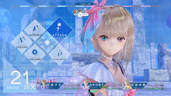
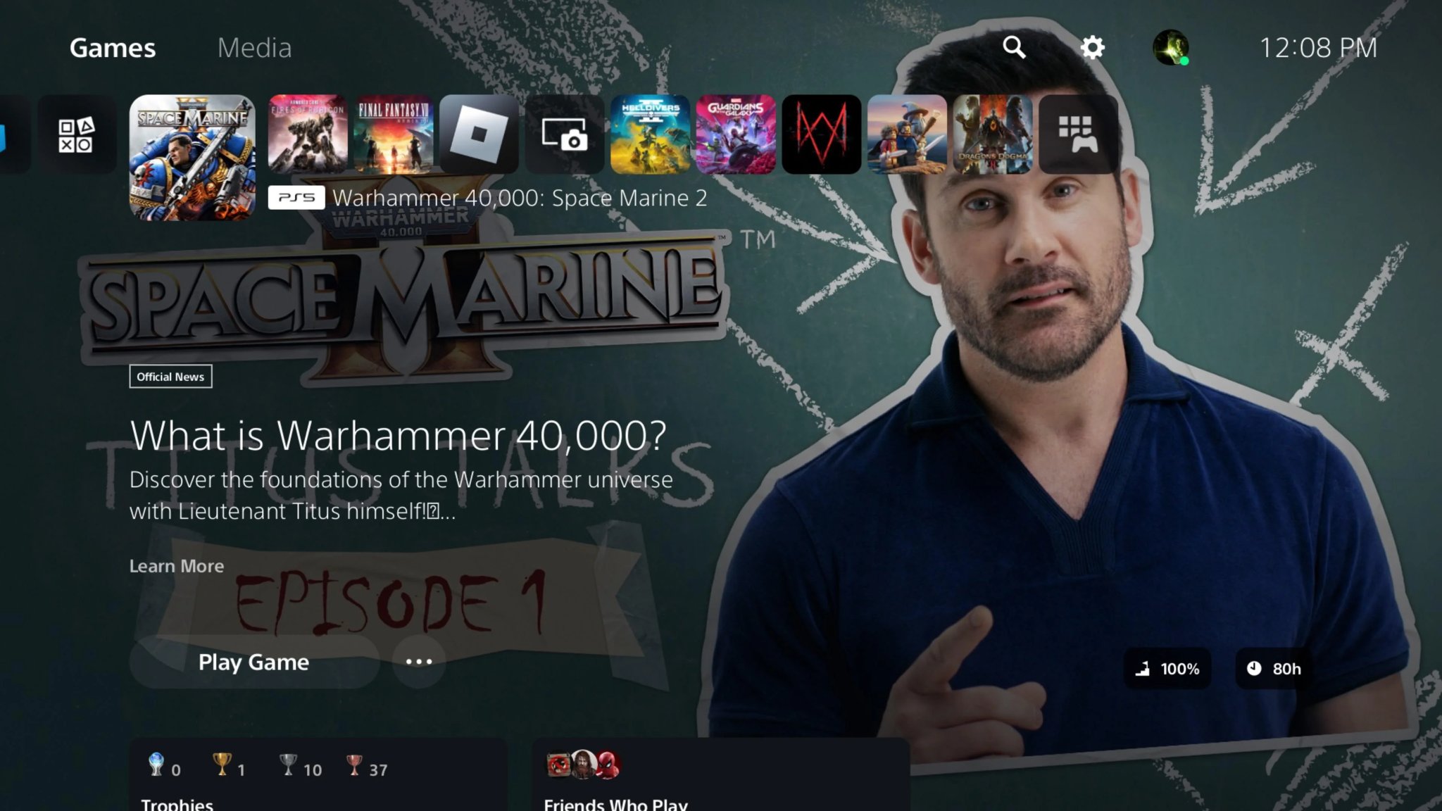
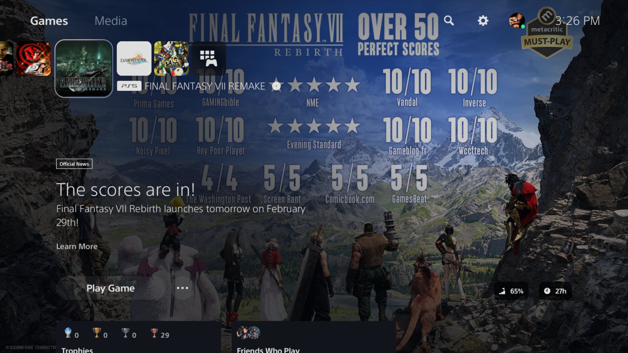
Gotta love modern consoles having increasingly unusable user interfaces. Post-blades Xbox 360 truly opened pandora's box.why are you guys such blindly following steam fanboys????
|
|
v


I have my gripes with Steam client's BPM mode, but even that is 200% better than the PS5's sorry excuse for an interface lol 
PS3 XMB is still peak Sony console UI design imo.

PS3 XMB is still peak Sony console UI design imo.
15 hours in one day with Frostpunk, I'm gonna dream with this game.
Anyone looking to play Tokyo Xanadu EX+ (Falcom's version of Persona) on PC, Switch version got a brand new localization.
You can import that localization into the PC version

Updated Localization + Turbo Mode :: Tokyo Xanadu eX+ General Discussions
The Switch port is getting an English release which includes turbo mode, and not only that, but is also getting an updated localization. Any chance this can be patched into the PC version or a brand new PC port made based on the Switch version?steamcommunity.com
Game
I had to look for what the deal is with the new localization, since it was never mentioned why.
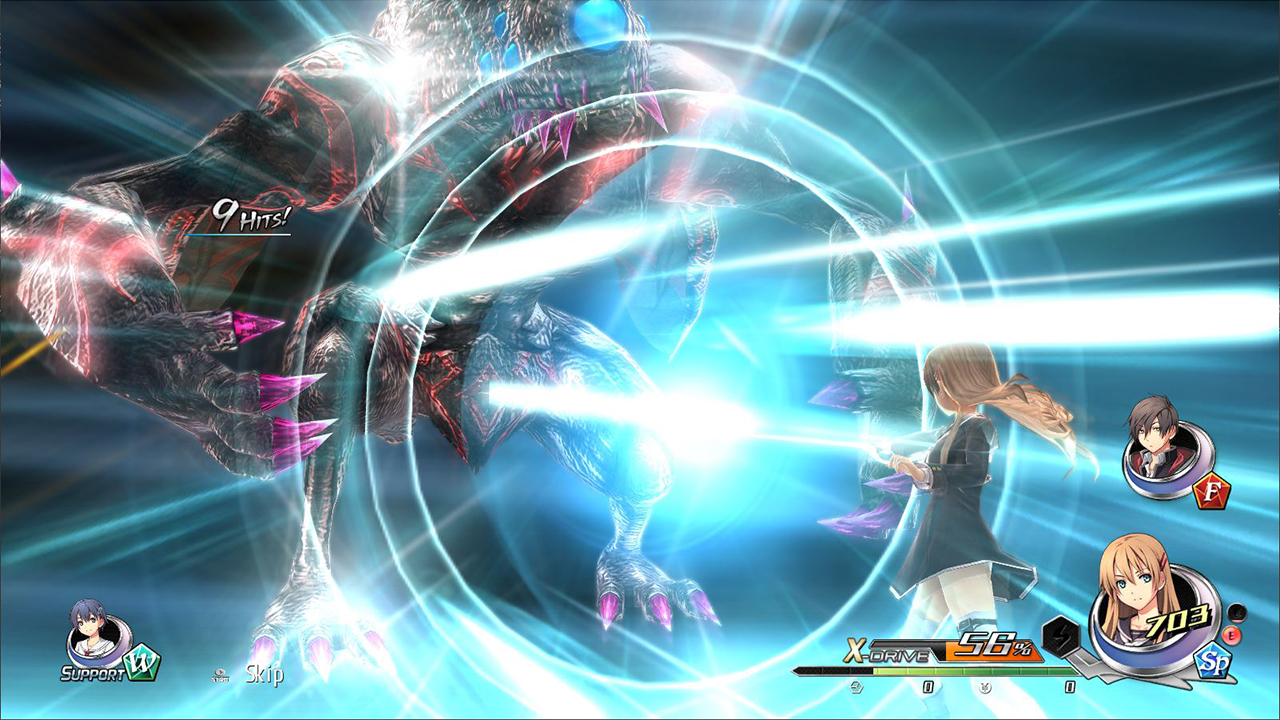
Tokyo Xanadu eX+ is coming to Switch with updated localization
Tokyo Xanadu eX+ is set to come to the west on the Nintendo Switch with a new localization. Tokyo Xanadu eX+ is an enhanced version of the game which was a PS Vita exclusive in 2015.
The original translation of the game was notoriously difficult to enjoy for some fans of Falcom games. Random terms and made-up words were thrown in for humorous effect, perhaps most notable was one character saying “Fukkeleducks” to get around actually swearing (in our opinion it just comes off as corny).
A small rant:
Sometimes I wonder if people think other people knows everything that you talk about. Is it so difficult to give context to anything? It takes a few minutes for you to explain. It takes forever for someone to look for information, especially if it's a recent thing and it hasn't spread so much yet...
I had to look for what the deal is with the new localization, since it was never mentioned why.
The old/PC version localisation wasn't necessarily bad, but it made one too many references to internet colloquialism at the time, and later parts of the game seems to be still in need for another editing pass or two.
The new/Switch localisation is much better since they went with similar direction to Trails series' localisation style.
Also, unrelated to TX, I would appreciate it if you refrain from using Nichegamer as a source. That website is a bad site run by bad people. Stealing news from Gematsu, manufacturing outrage towards LGBTQ+, anti-localisation, “anti-wokeness” toxicity and whatever else.
Also, unrelated to TX, I would appreciate it if you refrain from using Nichegamer as a source. That website is a bad site run by bad people. Stealing news from Gematsu, manufacturing outrage towards LGBTQ+, anti-localisation, “anti-wokeness” toxicity and whatever else.
I usually don't read any news outlet, most of my source is either from here or reddit, tbh none of them (sorry) is really good news source... I did a simple google search since no context was given. Nichegamer was the first I found with useful information
Blue Reflection's UI is amazing.People like to hate on Blue Reflection, but if there's one thing that I think that game absolutely aces, it's UI design. It's in the same camp as Persona 5, Smash Bros Ultimate, and Sonic Forces in terms of having a clean looking UI oozing with style. They even have animations on certain UI elements, like with battle actions.

When I was playing it I actually took a video of it to show to some co-workers (since we were working on UI at the time and I was pointing out just how much work Gust put into that for this niche game),

Epic is suing Google — again — and now Samsung, too
The Auto Blocker conspiracy theory.
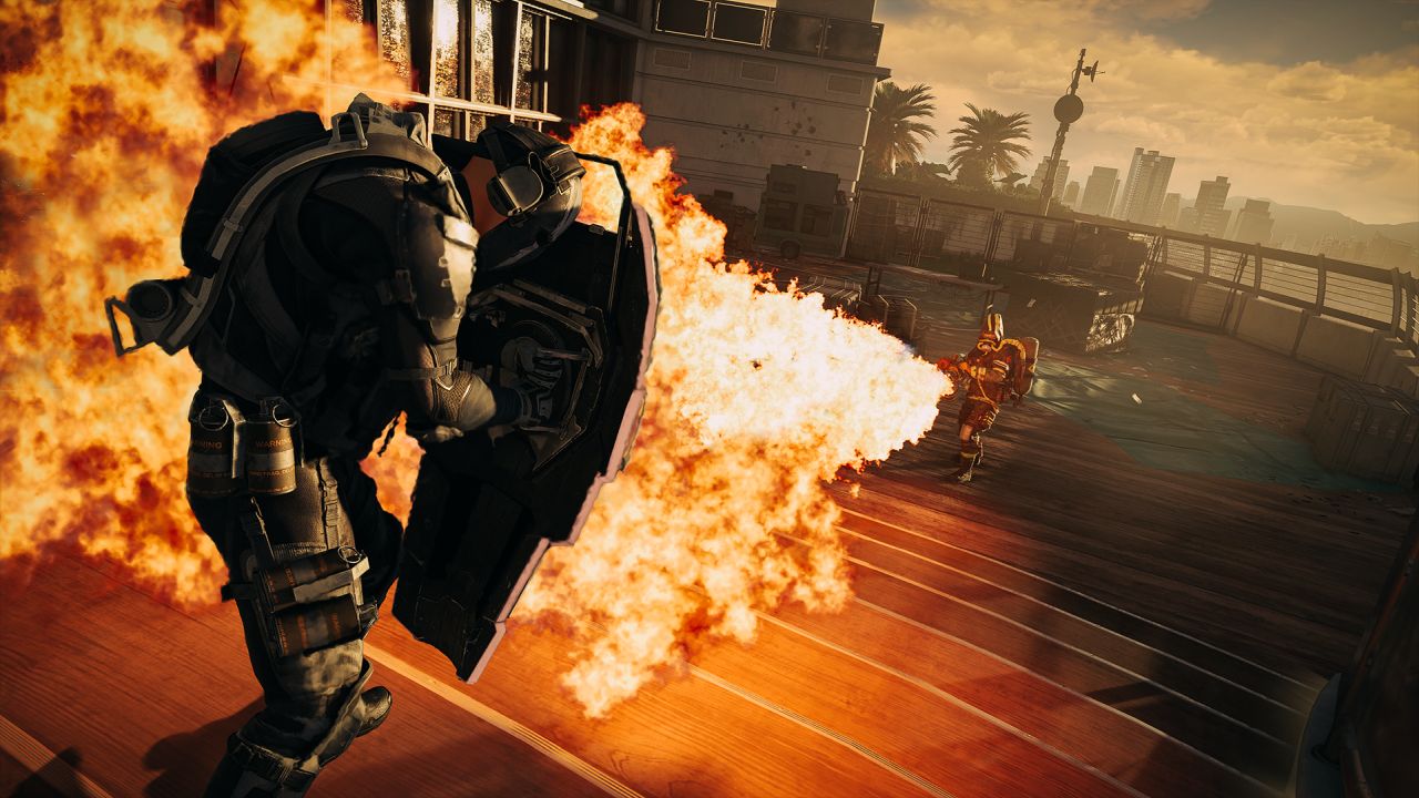
Ubisoft Says That XDefiant Has Fallen Behind Expectations
Ubisoft CEO Yves Guillemot has confirmed that XDefiant has fallen behind expectations amid company struggles.
A silver lining for XDefiant, though, is a push to Steam. While I’ve not been told the game will come to the platform for definite yet, Ubisoft’s recent announcement that its games will be coming to Steam on Day 1 has understandably reignited the team to push for it internally. So, fingers crossed, XDefiant will make its way to Steam soon.
Probably too little too late, especially with Black Ops 6 coming soon, but good to see Ubisoft appears to be committed to Steam again.
Looks nuts, claymation, crpg and parasite eve rolled in one.
Last edited:
Been playing FFXVI. Still quite early (level 20) but I'm still not really feeling the combat. It's still button mashing for the most part with occasional skill uses and dodges. The narrative, cutscenes and boss fights are quite a spectacle though, the stuff that you wouldn't see in lower budget games. I also love some of Yoshi-P's touches in there, from world building to combat mechanics.
The new Sims game has been leaked (Project Rene) turns out it's just a shitty mobile game
Leaks of project Renee. Thoughts? : r/thesims (reddit.com)
The combat literally never changes. What you see is what you get.
Even calling it button mashing is generous, since the skills are all you really do most fights apart from bosses.
Actual awesomebutton gameplay.
By the end i just really wanted it to be over.
Story unfortunately also doesn't really come together imho.
Leaks of project Renee. Thoughts? : r/thesims (reddit.com)
Been playing FFXVI. Still quite early (level 20) but I'm still not really feeling the combat. It's still button mashing for the most part with occasional skill uses and dodges. The narrative, cutscenes and boss fights are quite a spectacle though, the stuff that you wouldn't see in lower budget games. I also love some of Yoshi-P's touches in there, from world building to combat mechanics.
The combat literally never changes. What you see is what you get.
Even calling it button mashing is generous, since the skills are all you really do most fights apart from bosses.
Actual awesomebutton gameplay.
By the end i just really wanted it to be over.
Story unfortunately also doesn't really come together imho.
I'd imagine they want something that covers all platforms, with both a mobile interface, and more in-depth UI on console and PC. That it will feature heavily around monetisation is not really news, it would be stranger for new Sims games not to double down on that. I am not sure how you motivate the big fanbase around the older games to move on to this, though. It doesn't look like it does anything super special compared to the previous games, but then again I haven't touched a Sims game in over a decade or two, so I can hardly speak about that.The new Sims game has been leaked (Project Rene) turns out it's just a shitty mobile game
Leaks of project Renee. Thoughts? : r/thesims (reddit.com)
Sorry man, I found it useful and made a quick post (since there are JRPG fans here).A small rant:
Sometimes I wonder if people think other people knows everything that you talk about. Is it so difficult to give context to anything? It takes a few minutes for you to explain. It takes forever for someone to look for information, especially if it's a recent thing and it hasn't spread so much yet...
Consider also, other person doesn't have enough will (and also time) because they are engaged in other things?
That the post they made out of the betterment for forums members by taking time and mental energy out of their current work?
Video mentioning localization for the Switch re-release (timestamped)I had to look for what the deal is with the new localization, since it was never mentioned why.
Last edited:
Been playing FFXVI. Still quite early (level 20) but I'm still not really feeling the combat. It's still button mashing for the most part with occasional skill uses and dodges. The narrative, cutscenes and boss fights are quite a spectacle though, the stuff that you wouldn't see in lower budget games. I also love some of Yoshi-P's touches in there, from world building to combat mechanics.
I actually quite like the combat system. You have to dodge/parry relatively often and it's pretty satisfying when you do. I think bigger enemies and bosses could stand to be less HP-bloaty but the spectacle makes the fights fun.
- Status
- Not open for further replies.


